Advanced Web Interface (AWI) aka it's like TweetDeck
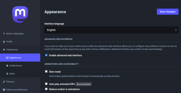
Visit Settings > Preferences > Appearance and enable Advanced Web Interface for a multi-column layout which may remind you of TweetDeck.
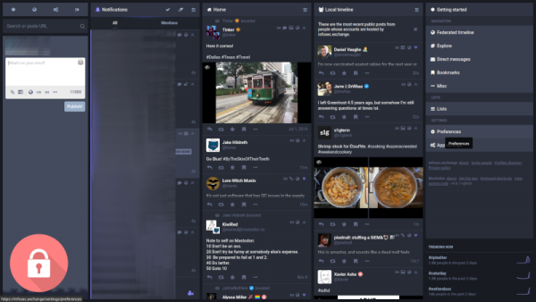
When you enable the Advanced Web Interface, you have the opportunity to 'pin' multiple columns to the web interface. Below the image shows Notifications, Home and Local Timeline columns have been pinned.
The fifth column shown is the Getting Started Column. This right-most column adjusts depending on the users selection.
Compose Column
With the Advanced Web Interface enabled, besides ability to write your toots and search for users and hashtags, the Compose column (to the left) has an icon menu at the top. The icons represent Getting Started, Home, Local Timeline, Federated Timeline, Preferences and Logout.
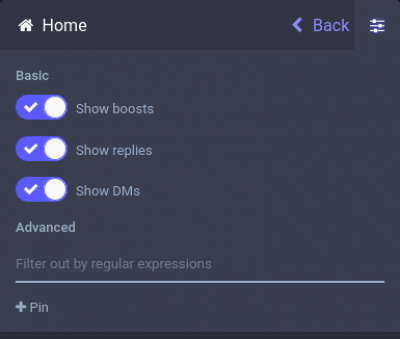
Selecting the icon will open that column. Select the columns configuration Icon to see the options. The Notification Column has a fairly extensive matrix allowing you to tailor your experience. The others look similar to the 'vanilla' experience, only with the addition of a regex filter… neat 
Getting Started

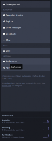
Getting started changes the far right column to show useful links, similar to the vanilla web interface. Selecting any of the Navigation icons will switch the view accordingly.
Here you can access settings and view your lists. It also provides easy access to your DM's and Bookmarks. An interesting feature is Explore.
Explore subdivides the fifth column into popular Posts, Hashtags, News and For you.
There is also the Misc menu that shows further notable content such as Keyboard Shortcuts, Muted and Blocked users, Pinned and Favourite posts.
At the bottom of getting started, you can find important instance links such as About, the Profile Directory and trending hashtags.


